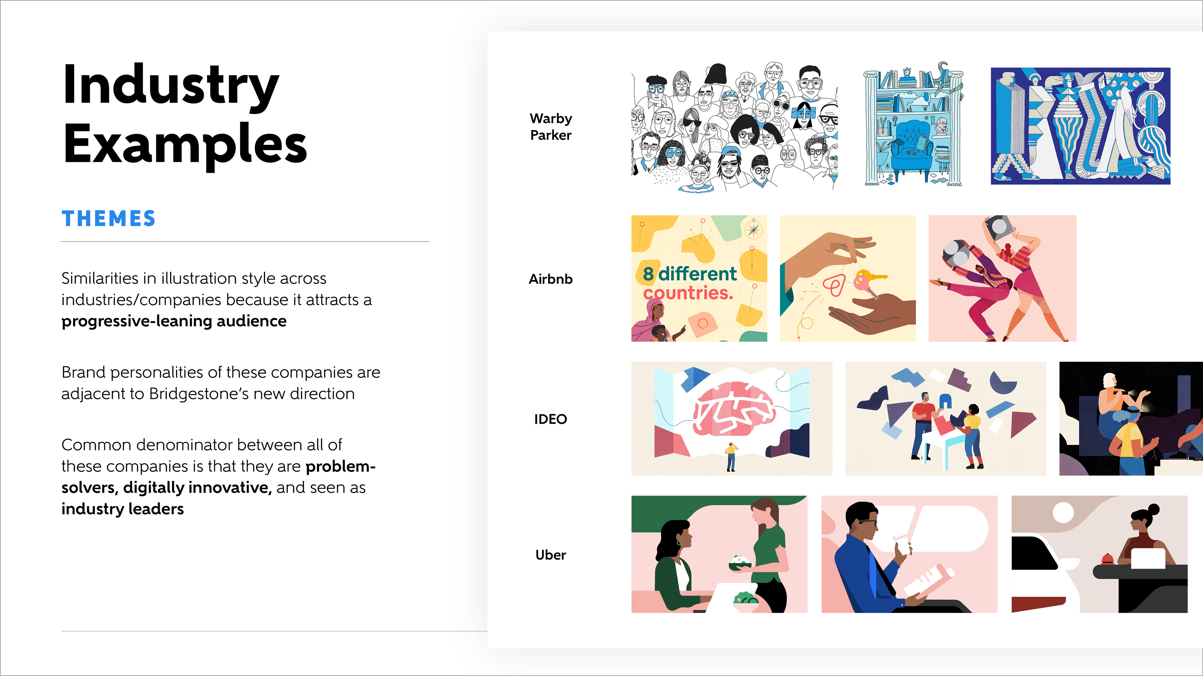
Objective
Bridgestone US was looking to create a series of compelling illustrations that reinforce the company’s new strategy, elicit emotion, and enhance a sense of connection for teammates. These visualizations are to be used in different presentations and internal marketing assets across the company to build excitement around Bridgestone's desire to become more of an overarching solutions provider, as opposed to just a tire company.
After walking the client contact through a creative exercise, we came out with a few descriptors that these illustrations should embody:
sustainable, progressive, digital, confident, quality, and trusted.
Based on my translation from what I was hearing from the client, a few others I tacked on for consideration were:
socially responsible, emotionally intelligent, and authentic.
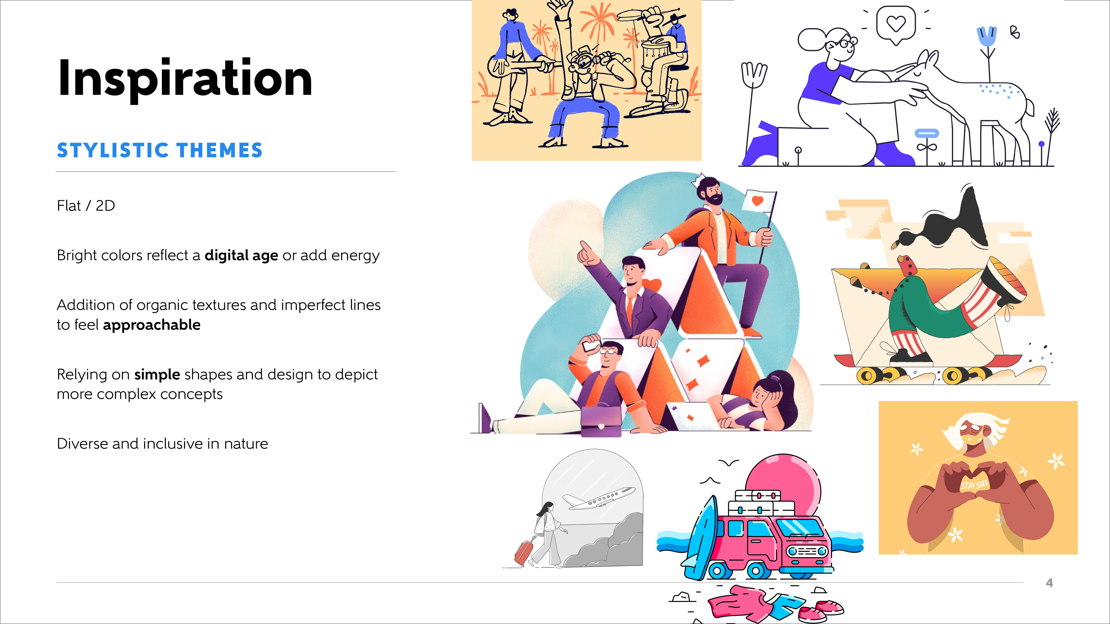
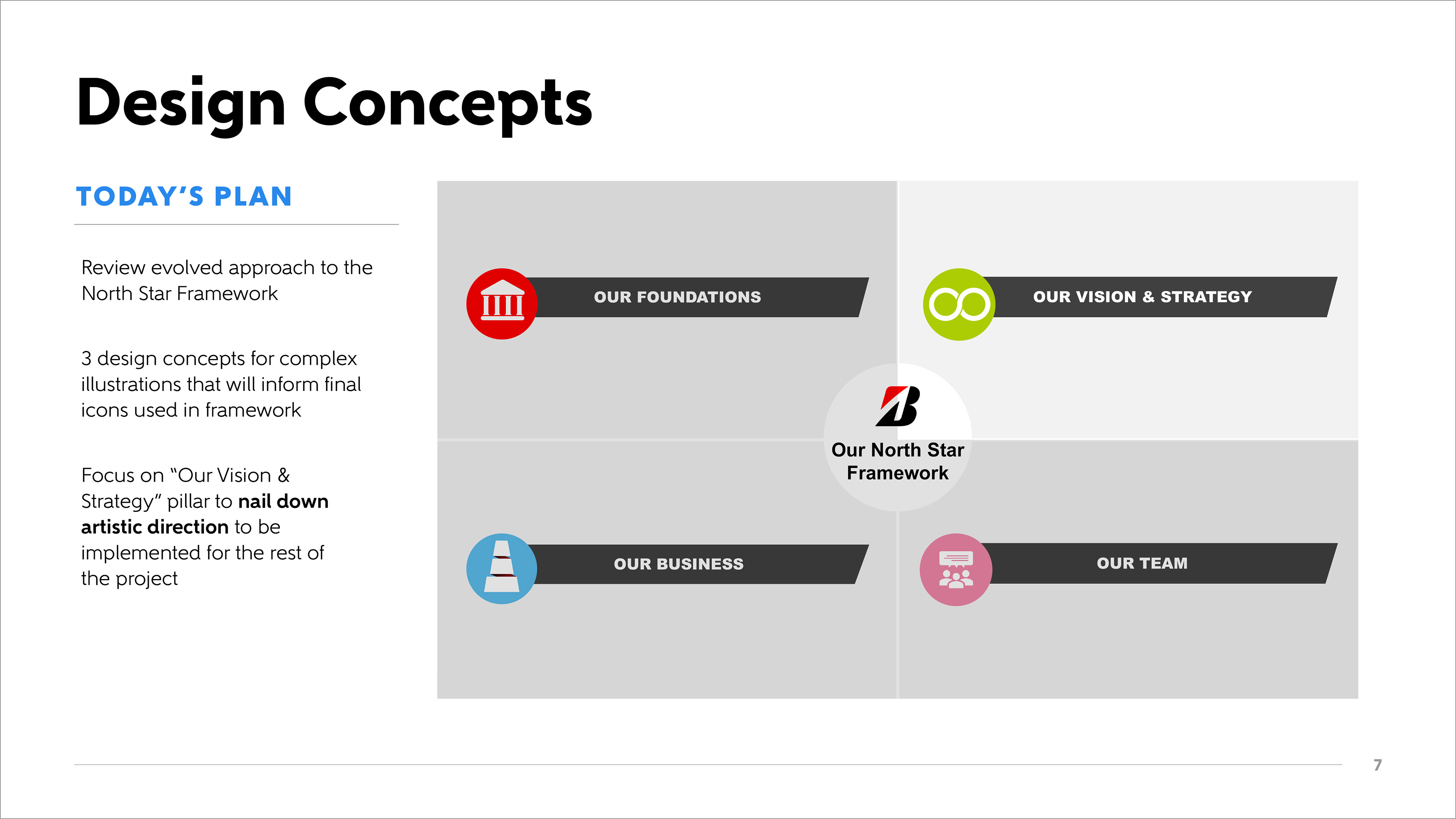
Mood board


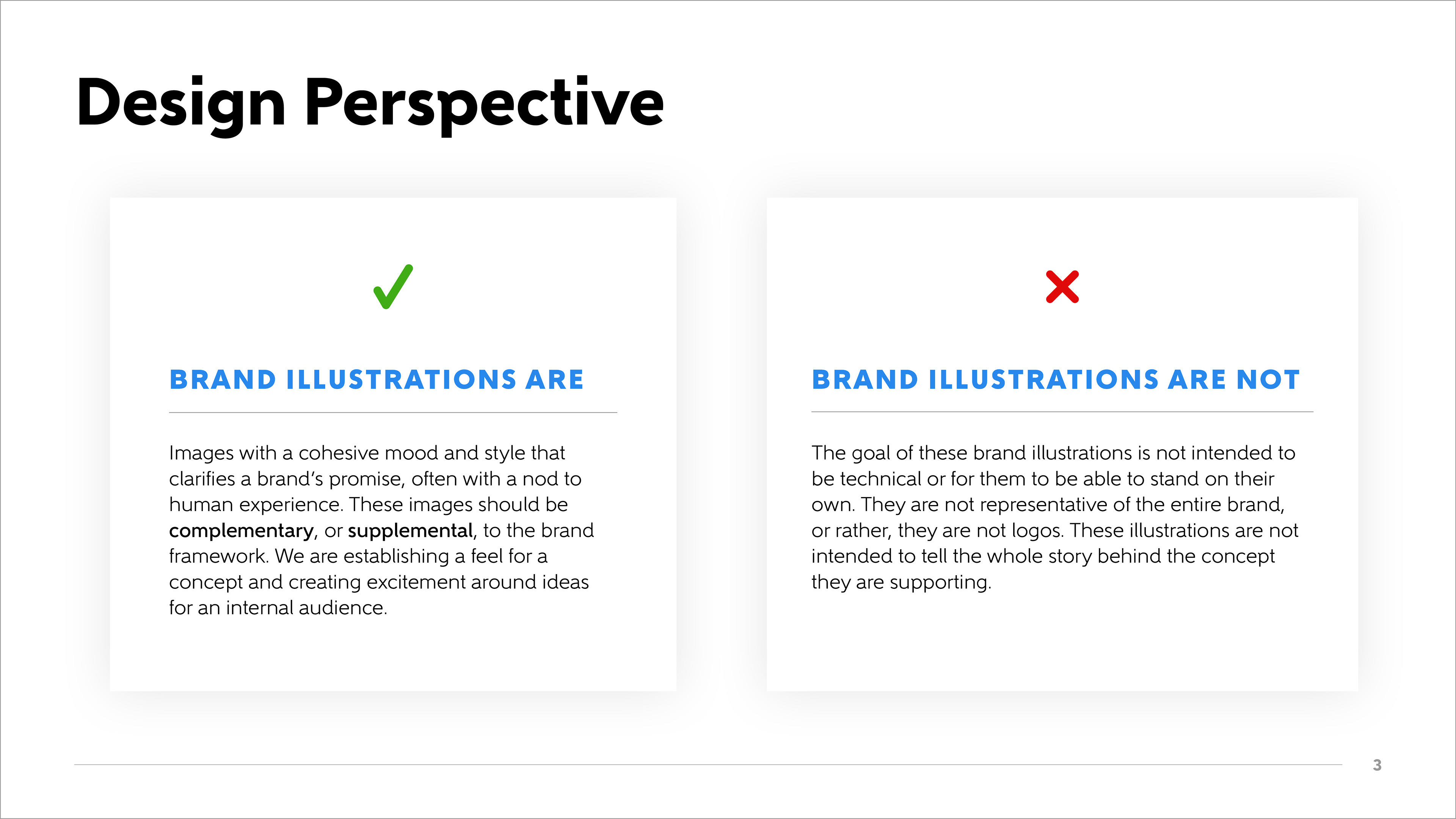
Parameters
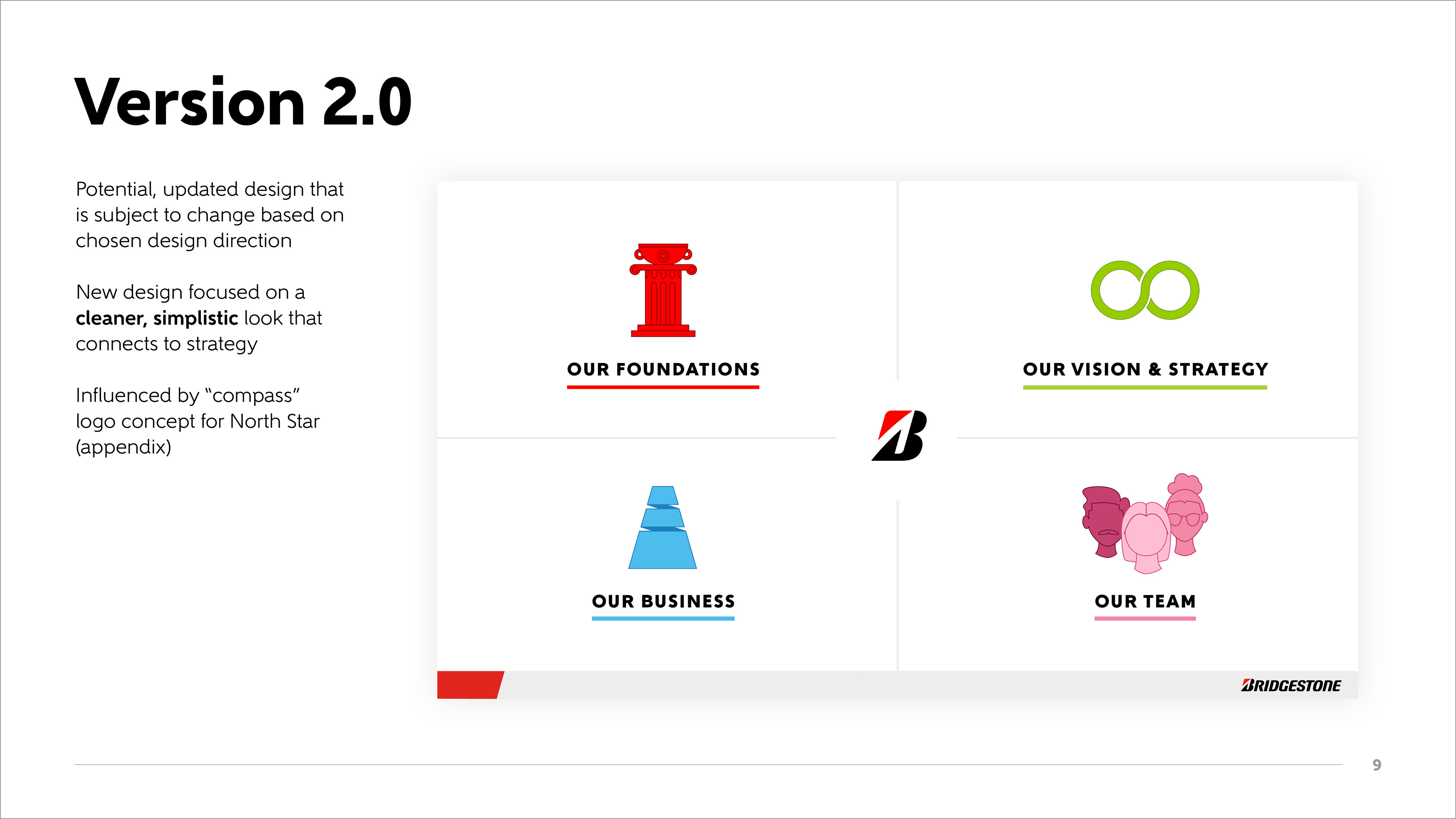
A few directives around these illustration concepts came from work that was already established at Bridgestone, prior to this project. For their new strategy, there were four pillars established, one of them being "Our Vision and Strategy" which is what these illustrations are centered around. Other design elements, such as the green color, and the infinity symbol (that could not be re-stylized or edited) were important to incorporate into the design. One of the challenges was incorporating this infinity symbol without it clashing with the style of illustration I felt was necessary to execute on the initial objective.

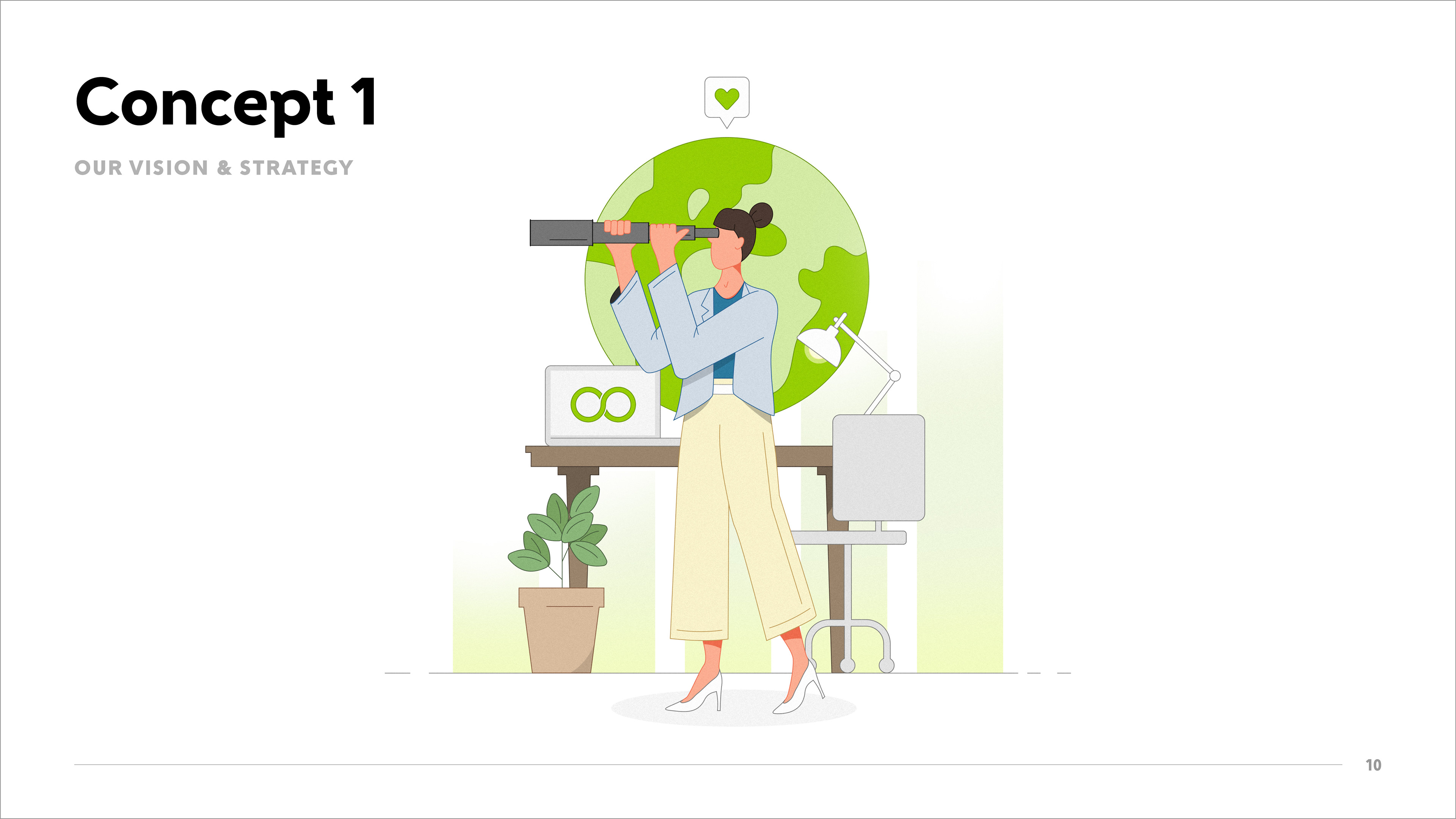
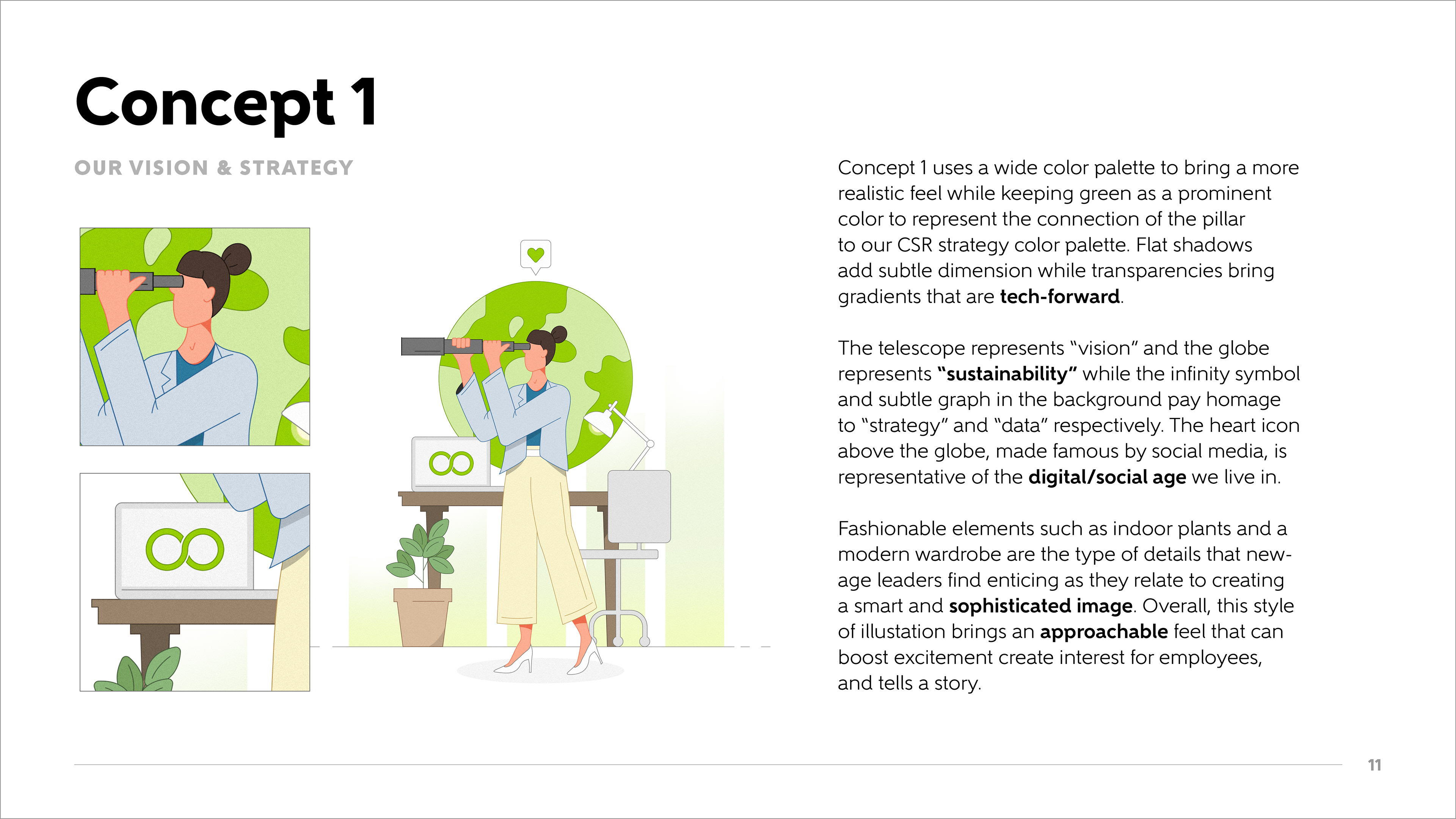
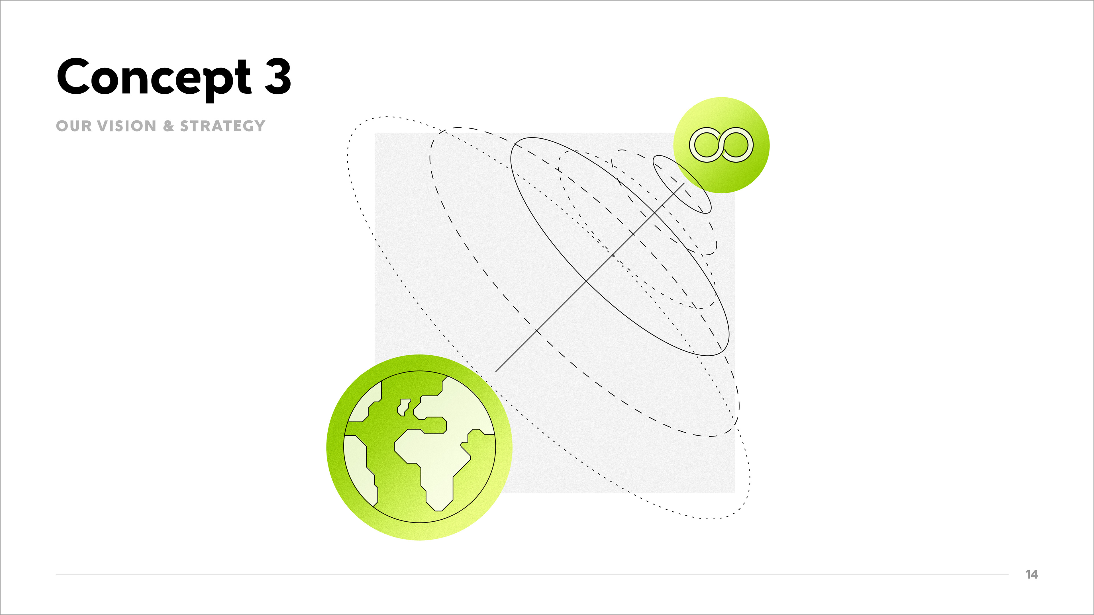
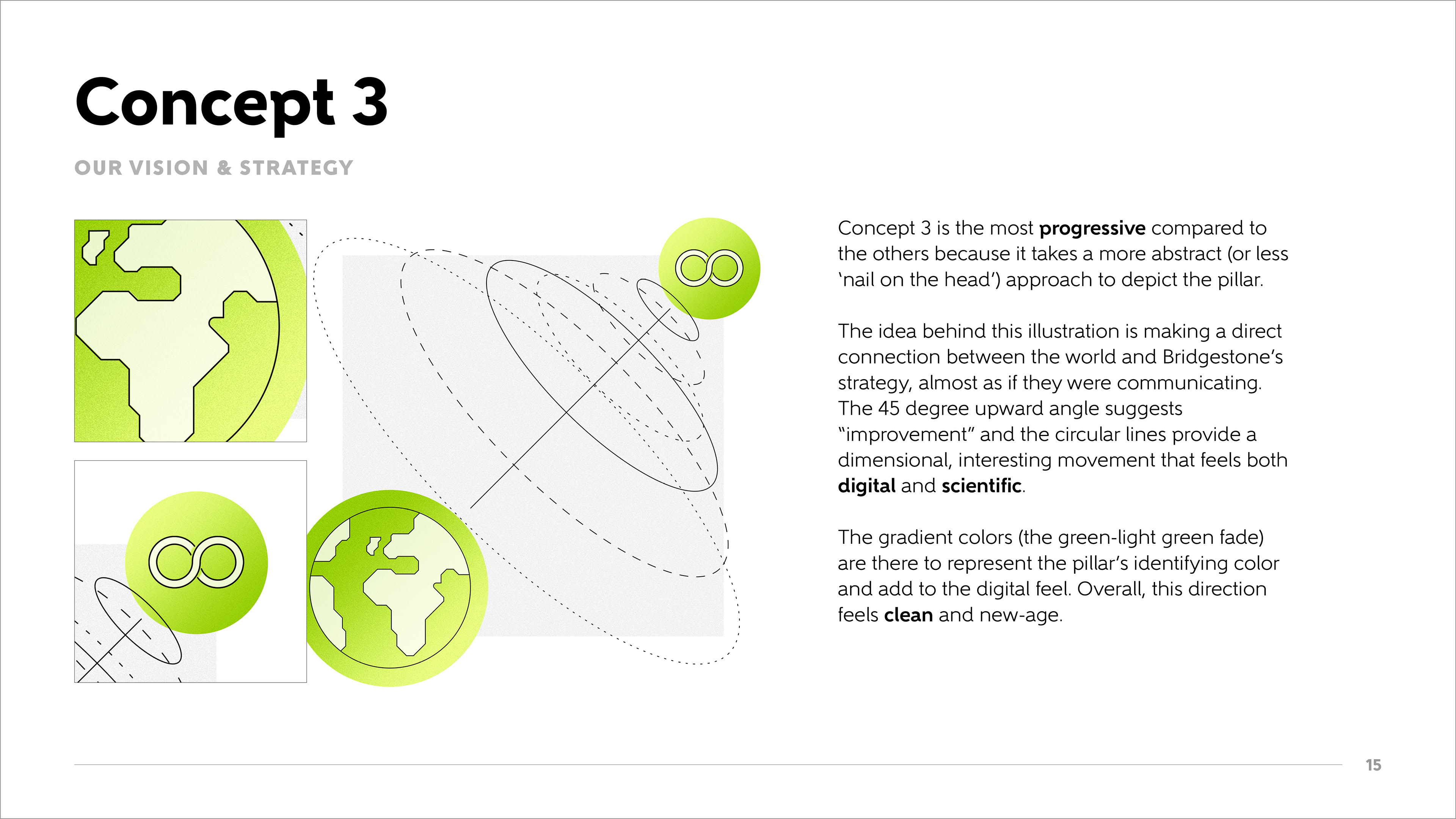
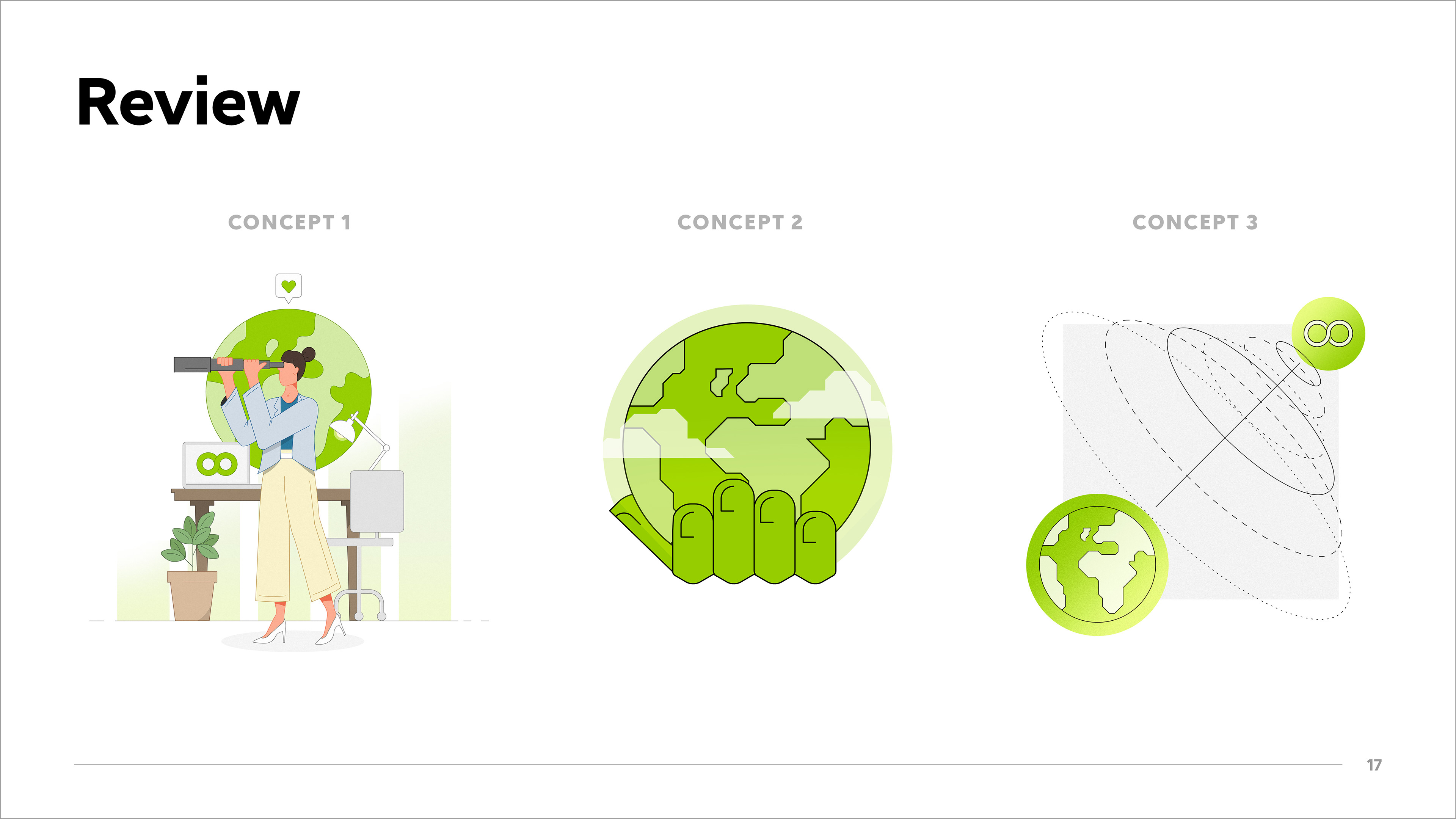
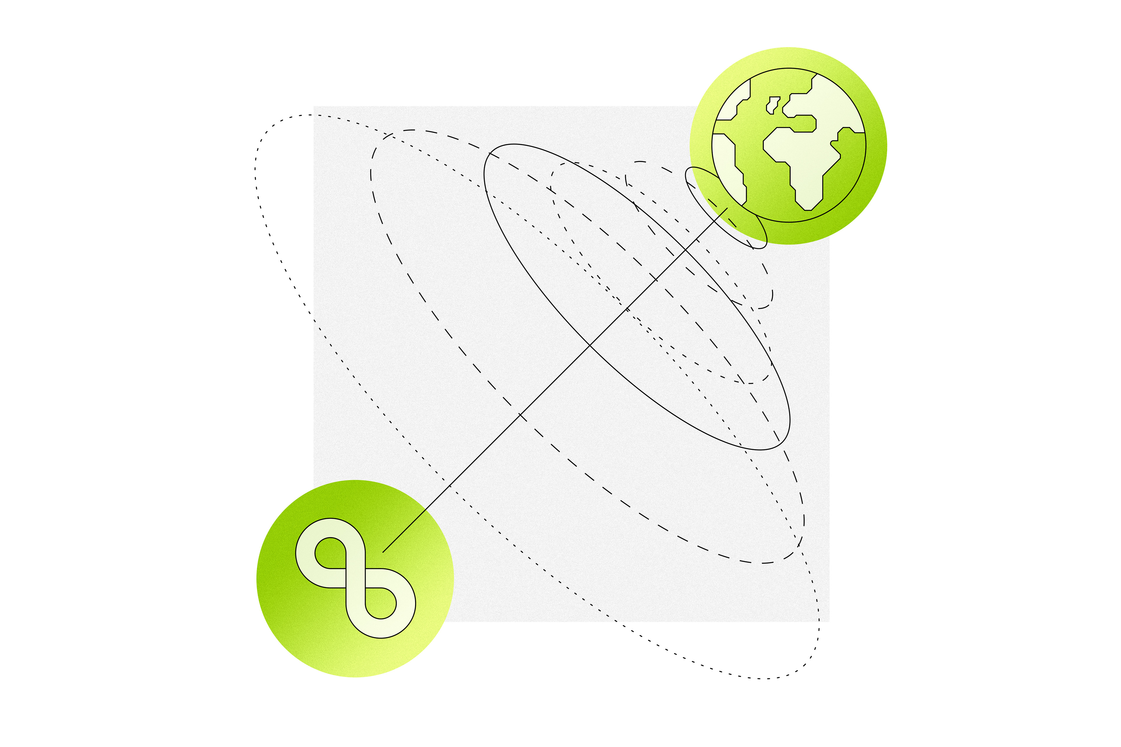
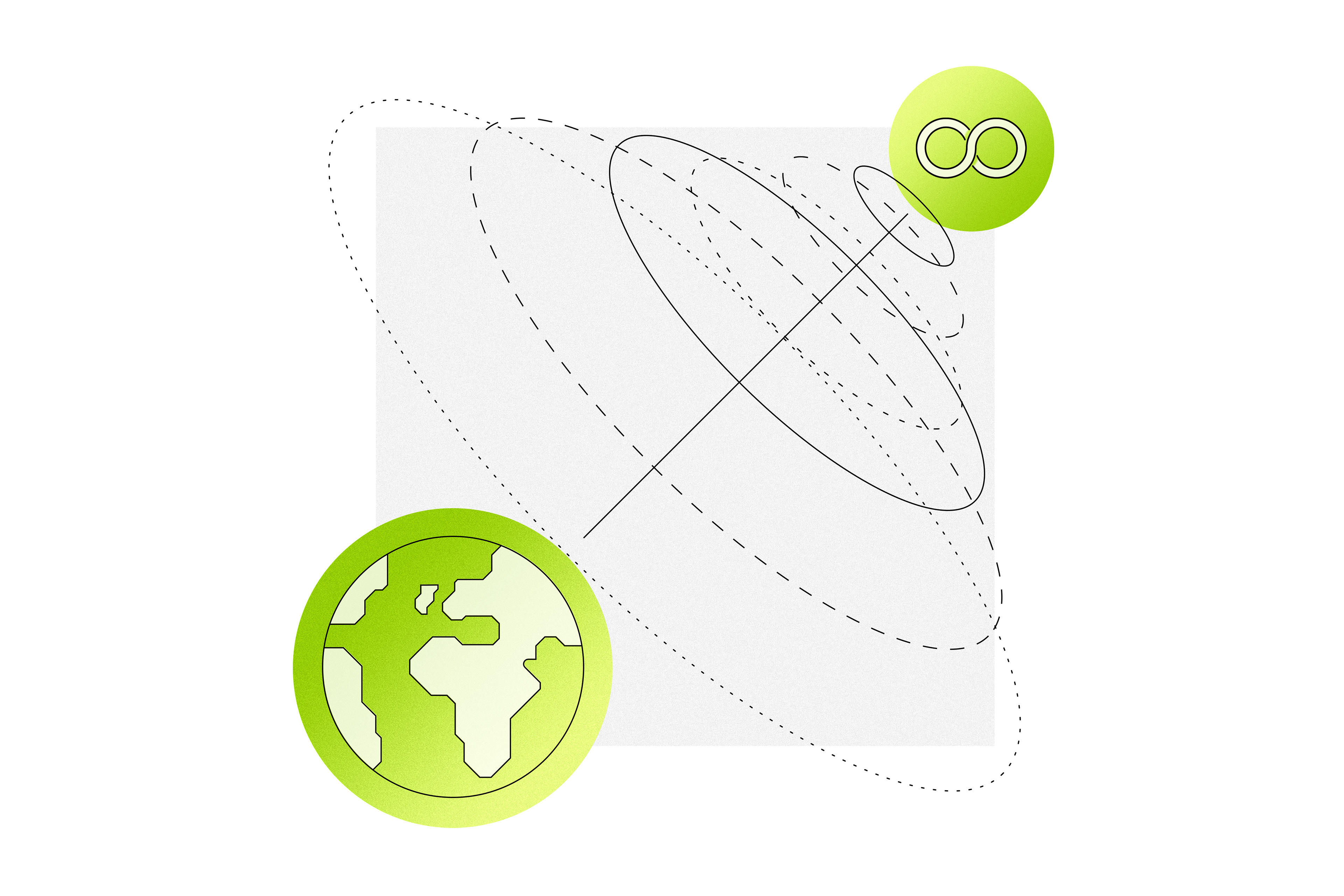
Concept 1


Above: Two variations that lead to the final one, below.
Concept 1 uses a wide color palette to bring a more realistic feel while keeping green as a prominent color to represent the connection of the pillar to our CSR strategy color palette. Flat shadows add subtle dimension while transparencies bring gradients that are tech-forward.
The telescope represents “vision” and the globe represents “sustainability” while the infinity symbol and subtle graph in the background pay homage to “strategy” and “data” respectively. The heart icon above the globe, made famous by social media, is representative of the digital/social age we live in.
Fashionable elements such as indoor plants and a modern wardrobe are the type of details that newage leaders find enticing as they relate to creating a smart and sophisticated image. Overall, this style of illustation brings an approachable feel that can boost excitement create interest for employees, and tells a story.

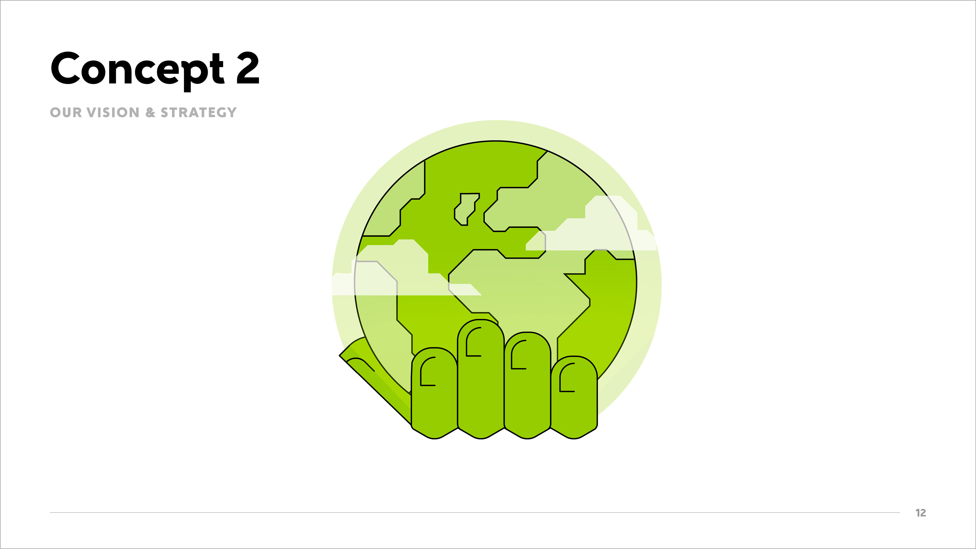
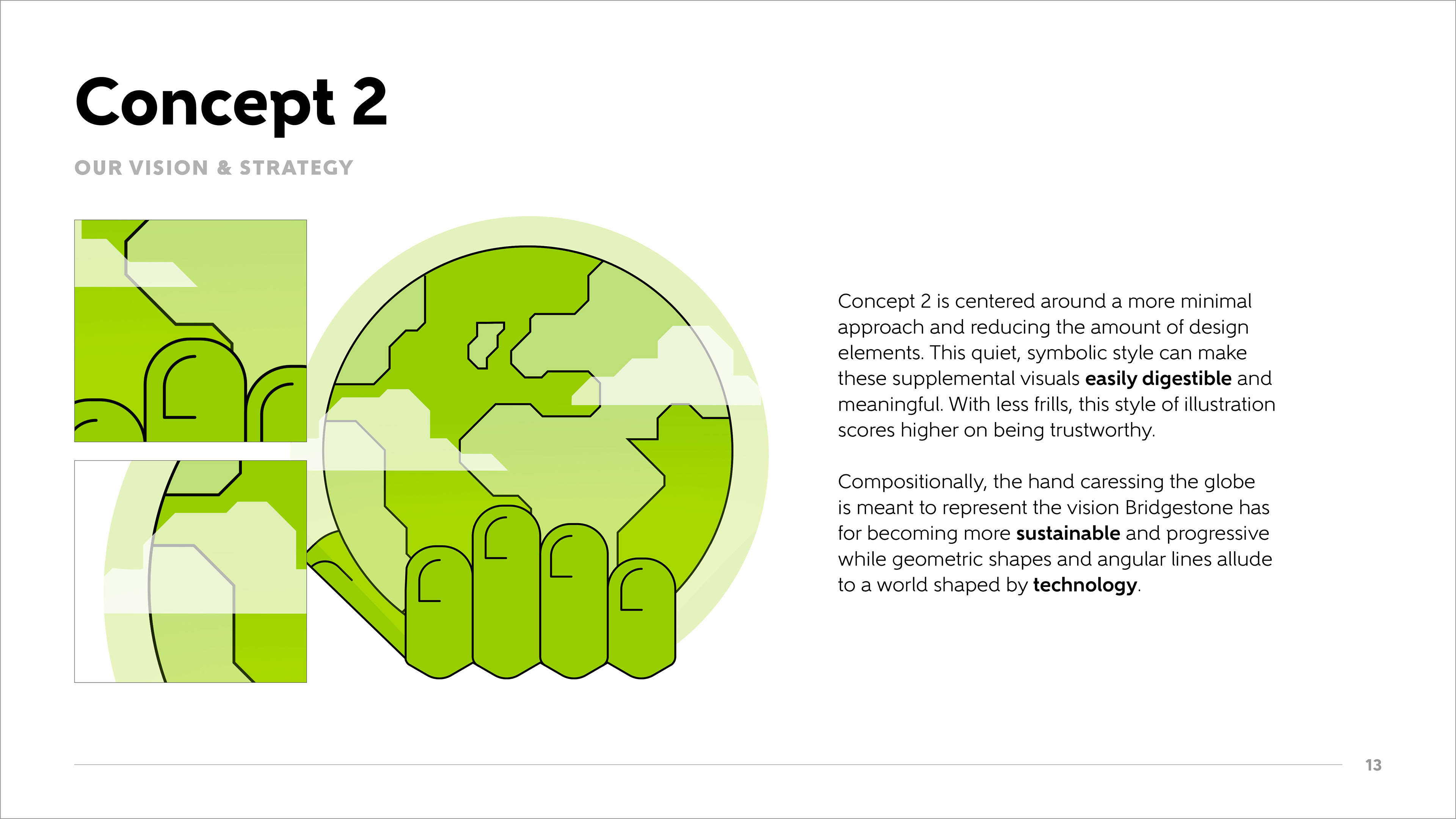
Concept 2

Above: Two variations that lead to the final one, below.
The idea behind Concept 2 is making a direct connection between the world and Bridgestone’s strategy, almost as if they were communicating. The 45 degree upward angle suggests “improvement” and the circular lines provide a dimensional, interesting movement that feels both digital and scientific.
The gradient colors (the green-light green fade) are there to represent the pillar’s identifying color and add to the digital feel. Overall, this direction feels clean and new-age.
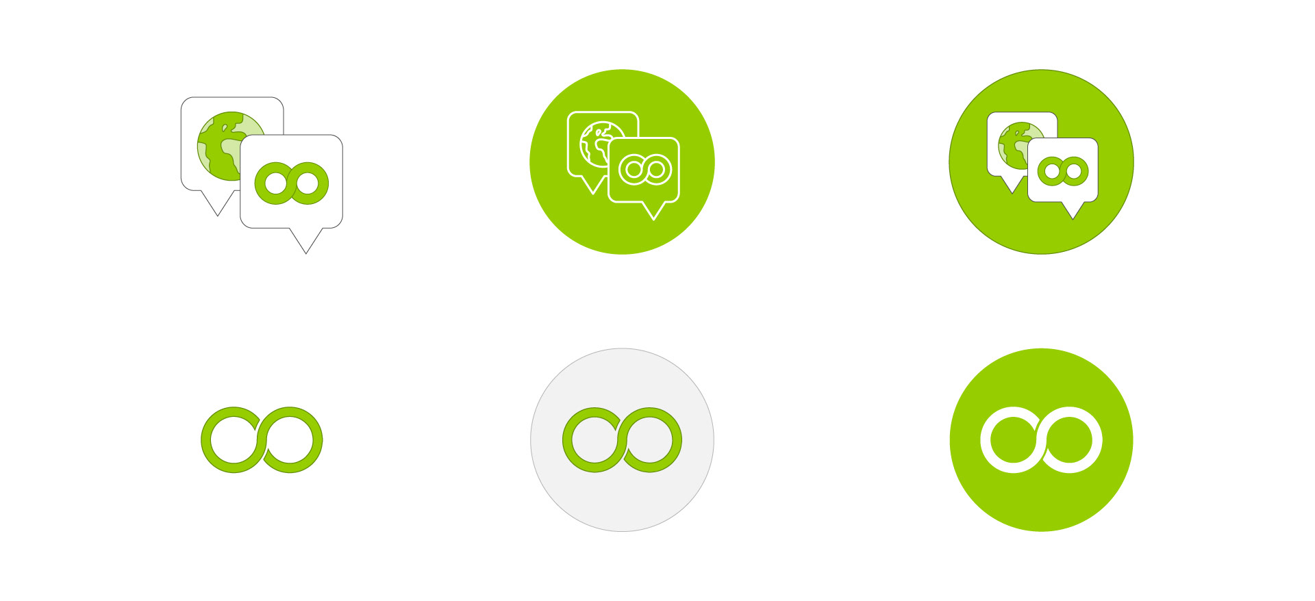
Icon exploration
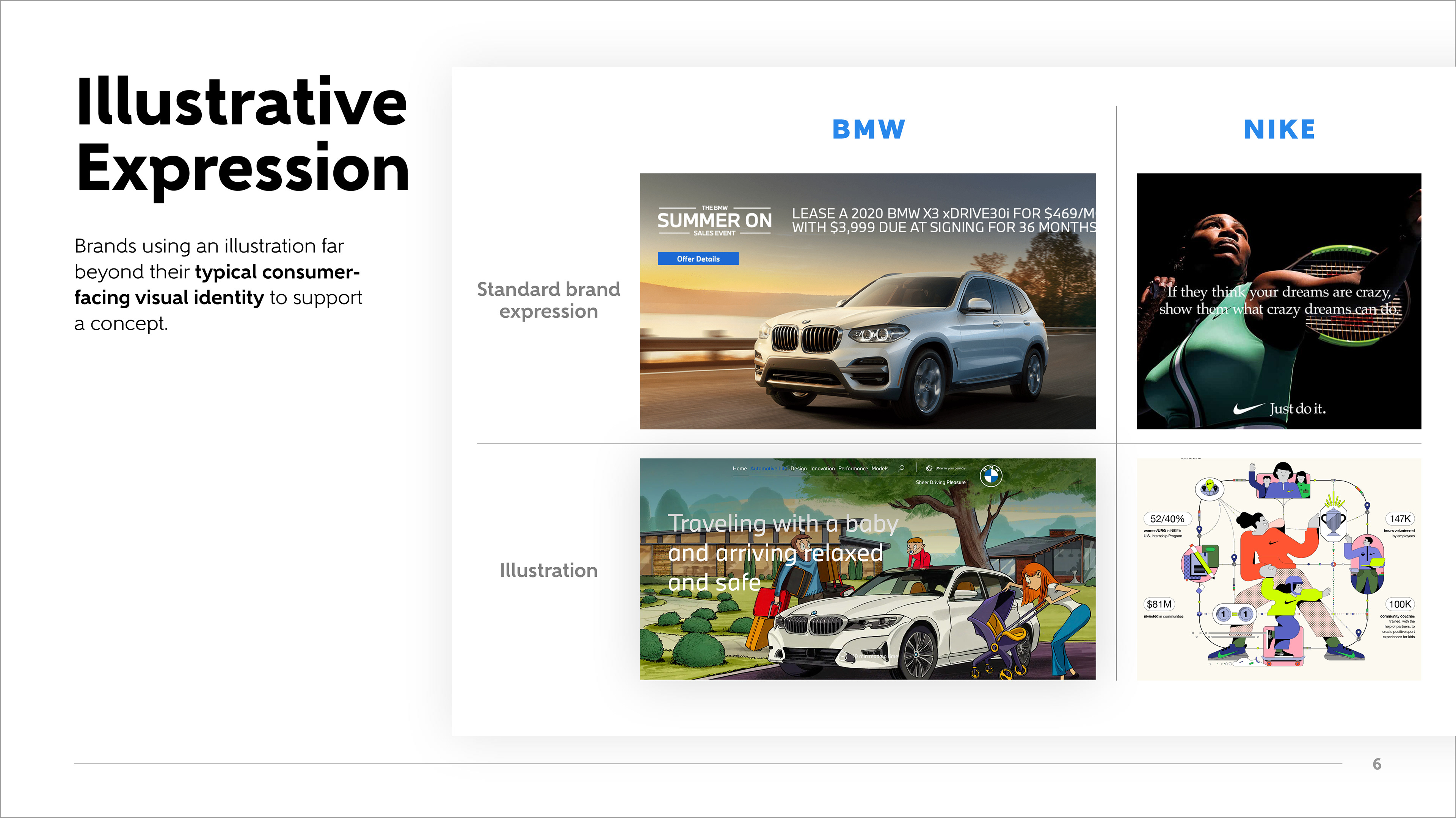
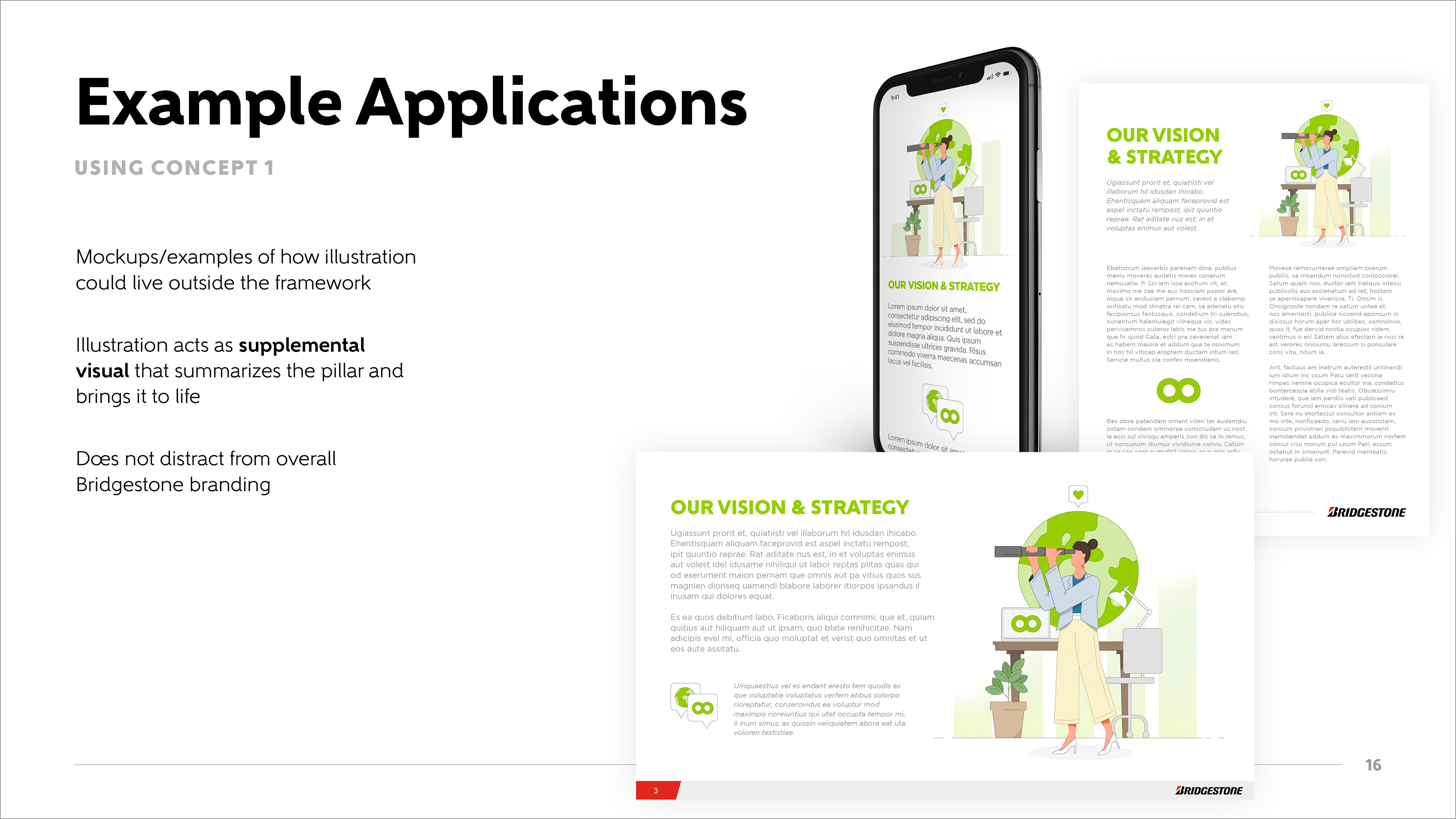
Client presentation
Given that the audience and stakeholders for presenting design concepts was made up of C-suite executives and other high-ranking marketing officials, it was that much more important to provide plenty of context around the design decisions to gain buy-in and ground them in the direction for the illustrations. Clients lurv real-world examples, amiright?